Strategizing to increase user conversions for Mumbai University
PROJECT TYPE:
Individual contributer- self initiated project
ROLE:
UX designer | UX strategist | UI designer
DURATION:
10 weeks
Select the sections you want to jump to:
WHAT'S INTERESTING?
Project Overview
This project explores the UX journey from challenge to innovation for the Institute of Distance and Open Learning (IDOL), a program initiated by the University of Mumbai that delivers education through correspondence courses.
What I did
In this case study, I showcase the redesign process for both first-time and returning visitors of the website, aiming to simplify the journey from course search to sign-up. The primary objective was to address navigation issues and employ UX strategies that enhance the discoverability and interest quotient of the content. The ultimate goal was to reduce bounce rates and increase admissions.
As a UX strategist and designer, I navigate through challenges, leveraging psychological principles to reimagine and refine the overall user experience.
Project impact
Higher discoverability of content
Through content restructure and intuitive navigation.
Higher visitor retainment
Through personalized and simplified task journeys.
Increased trust factor
Through transparent information disclosure
PROPOSED DESIGN
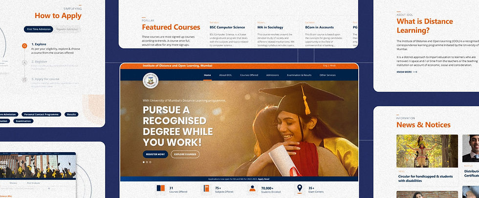
Quick glance at the re-design
As you scroll, you'll gain insights into the thought process, UX and psychology strategies, and other considerations that supported the redesign.
.png)
Carousel Banner
Multiple images with varying
copies to help resonate with different target groups
Creating Curiosity
Talking about the features creates curiosity and further motivates users to scroll.
Evoking Emotions
Using images to invoke a sense of happiness, pride, and motivation to encourage users to scroll further.
Displaying offerings
Using cards to display courses that create interest for the user. Thereby dropping the bounce rate.
Project objective.
Considering the diverse audience that takes admission at IDOL, my goal was to design a platform that makes it intuitive for the users to use and even aids the business.
MOVING FORWARD
Research Plan
To best understand what users need, I prepared a research plan to conduct interviews with 6 participants.
Target Audience: Characteristics
Some questions asked
People currently interested in enrolling for a full-time or part-time online bachelor's/ master's/ diploma program.
Research Activities
-
Task analysis:
To share their screen and create a profile to register for any course of their choice. -
Research Interviews:
To understand the users' perspective and knowledge of IDOL.
-
Which course have you been considering pursuing? Why?
-
From your understanding, can you tell me how IDOL distance learning works?
-
How do you choose the course you want to pursue?
-
What do you need to know about a course before you take admission?
-
What do you think the platform needs to make it for easy for you to use?
PRIMARY RESEARCH
Persona and User Journey
Currently pursuing Fashion design from Indian School of design and innovation, Mumbai.
19 years | Mumbai
Sakshi has always lived a comfortable life in Delhi. She has always been dependant on other people. After moving out to Mumbai for college, she has to live away from family and manage life on her own. She wants to pursue & practice fashion styling.
Motivation:
-
Encouragement from college
-
Application for further studies
Challenge:
Psychographic:
Interested Course: BA Sociology
Sakshi Jalan

-
Long & monotonous process
-
Low patience
-
Confusing website
-
Lack of interest
Familiarity with technology
Currently working at a call center located on the outskirts of Mumbai.
18 years | Mumbai
Sunil’s father is a rickshaw driver and his mother is a housemaker. He is the oldest of 3 siblings. Though Sunil wants to study more but, the financial situation at home forces him to aid his father’s income. He heard about IDOL through the social workers who come to their slum.
Motivation:
-
Flexible study pattern
-
Dream of learning and getting a good job to help his parents
-
Encouragment from social workers
-
Fear of continued lifestyle
Challenge:
Psychographic:
Interested Course: Unclear
Sunil Singh

-
No computer at home
-
Difficulty with understanding English
-
Not much clarity about future job prospects after a course
Familiarity with technology
Stay-at-home mother of 2 kids
35 years | Mumbai
Shweta got married off at the age of 22. She worked as a teacher at a school for 3 years before she got pregnant & had to eventually give up her job in order to look after her kids. Her children have now started school and she has free time on her hands. She is looking to do her masters so that she can eventually start working again.
Motivation:
-
Being a role model for her kids
-
Becoming financially independent
-
Getting a higher position when she resumes work
Challenge:
Psychographic:
Interested Course: MA History
Shweta Patil

-
Time management
-
Getting back to studying after many years
-
Trusting the program
Familiarity with technology


1. Site Metrics
IDOL site metrics reveal the repercussions of users expressing dissatisfaction with the experience on the university website.
73.85%
Bounce Rate
This rate reveals that users are not finding what they expected to find. This supports that the user experience needs a change.
1.58 Min
Average visit duration
The low number reveals that website visitors are not engaging deeply with the content on the website.
~2
Average page visits
This low number reveals low engagement and interest with the website and its content.

2. Site Organization
An evaluation of the website uncovered issues concerning the hierarchy and organization of pages.
17
Pages ending in PDFs
This indicates that a significant number of pages terminate in PDF format. Resulting in frustration in finding information.
WEBSITE ANALYSIS
The problem
After realizing there was an issue in the journey from users, I wanted to cross-check it by analyzing the site myself.

3. Heuristic Evaluation
A thorough heuristic evaluation revealed usability problems on the website.
Match between system and real-world (32) | Visibility of system status (17)
FINDING SOLUTIONS
Strategizing the redesign approach
1. Card Sort
My objective was to identify user perception of potential site information and to re-structure the content such that it aligns with the visitors' mental models.
3 participants | 62 cards

Learnings:
2. Need to build trust
To help build trust in the IDOL brand, participants preferred there be easy-to-access information in the revamped content inventory
3. Reduce confusing items
Participants mentioned that they would want some confusing sections like "workshops" to be placed separately and that it would reduce confusion.
1. Need to re-group items
The group quickly agreed that they wanted all course-related details grouped together. They said this would allow them to find all course information in the same place.
2. Redesigned site map
Analysis of the card sort and content inventory gave birth to the redesigned site map.
The new information architecture prioritizes the needs of users and creates an easier path to help users find the information they need.

What has changed?
1. Easy discoverablity
The user can easily learn about the concept of IDOL and strengthen their trust in the brand and course.
2. Personlized paths
Users can choose the program they want to pursue and browse through the offered courses.
3. Simplified registration process
The registration process has also been simplified and properly explains the need and expectations from the users.
CREATING A FRAMEWORK
Layout and information strategy
I took inspiration from the Attention, Interest, Desire, Action (AIDA) framework and adapted it to suit the homepage context. While AIDA is traditionally applied to landing pages, I've customized it to reduce the bounce rate on the home page, ensuring a seamless user journey that catches attention, fosters interest, fuels desire, and ultimately prompts decisive action.
.png)
Leveraging relatable and appealing visuals along with persuasive language to capture people's attention and foster a sense of connection
Intriguing users by presenting relevant information they desired when landing on the page, ensuring that their interest is piqued
Creating desire by showcasing social proof and retaining users' attention with compelling narratives that elevate the perceived value.
As the user scrolls
Interest
Attention
Desire
Action
After creating an interest and desire, guiding users towards action by issuing clear and persuasive calls to take the next crucial step
RE-BRANDING
Style guide
The new brand colors were meticulously selected, following both color theory principles and the psychological impact of colors.
Combining dark blue and orange in the university website color scheme creates a balance between professionalism and creativity, stability, and vibrancy.


REDESIGNED SOLUTION
Interactive prototype
Reimagined homepage.
Information on the homepage is now laid out strategically to build trust and increase discoverability for users.


Increased discoverablity
Offering users the flexibility to explore bachelor's, master's, and diploma courses.
Personalized information
Employing cookies to display previously viewed courses, both commonly accessed and last visited, for returning visitors.
Invoking emotions
Rotating image carousel banner designed to inspire and resonate with individuals across various personas.
Trust building
Providing details about IDOL along with social proof to establish trust with visitors.
Redesigned journey.
The process of browsing to enrolling in courses is now simplified and redesigned to ensure a seamless registration experience for all user personas.
_gif.gif)


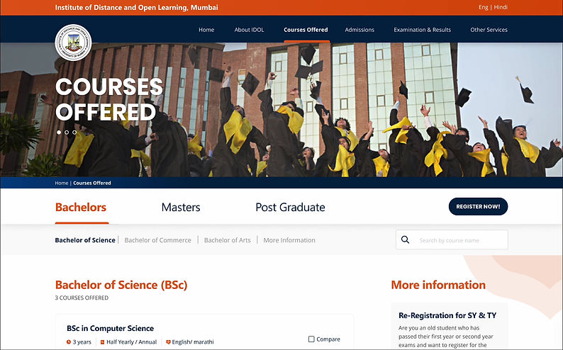
Efficient navigation
Implementing breadcrumbs across all pages enables users to effortlessly access any previous page in the journey.
Reduced cognitve load
Providing sticky tabs of various degree types helps users find all relevant information without getting overwhelmed.
Enhanced user control
Providing anchor tabs allows users to feel in control, allowing them to quickly jump between sections based on their preference.
Visual feedback
Highlighting the active section offers users visual cues, which helps them understand their location on the page.
.png)
Quick scan
Giving an overview of the features of the course allows users to quickly scan and select a course that meets their demands.
Creating urgency: Scarcity effect
Highlighting the number of seats remaining can drive users to act quickly, fearing they might miss out on something valuable.
Continue Exploring More Projects
Live project
Visual design | UX strategy and design
Academic project
UI design | UX design | Product design